How to Keep Using Sankey Visualization After Splunk 10 Upgrade
- Eric Jorgensen
- Aug 19
- 1 min read

Updated: Aug 21
The Splunk Sankey Diagram – Custom Visualization App officially reached End of Life and End of Support in December 2024. Until now, many users have still been able to continue using this and other Splunk-supported custom visualizations.
However, with the release of Splunk version 10, the legacy Sankey app will no longer function in Splunk Cloud environments.
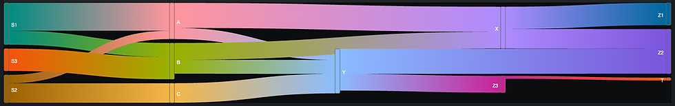
At Dataflect, we’re big fans of Simple XML dashboards and the flexibility they bring. To ensure Splunk users can continue leveraging Sankey visualizations without disruption, we’ve released the Sankey Visualization by Dataflect App — fully compatible with both Splunk Enterprise and Splunk Cloud.
This new visualization has the same functionality as the previous Splunk supported version - but with more options to customize.
🔹 Install the app on Splunkbase: https://splunkbase.splunk.com/app/7979
🔹 Documentation & usage guide: https://docs.dataflect.com/dataflect-sankey
Best of all, no changes are required to your existing searches or dashboards — everything that worked with the original Splunk Sankey Diagram app will work seamlessly with the new version.
For any questions, feel free to reach us at support@dataflect.com.